Signs of AI slop in design
AI can build a landing page in a minute. The problem is that it builds the same page every time. People have seen it so often that they spot it right away, and then they trust the product less.
We collected the signs that designers and design tools point out most often. Each one is fine on its own. But put a few of them on one page, and people will think nobody designed it.
1. Colored stripe on rounded cards
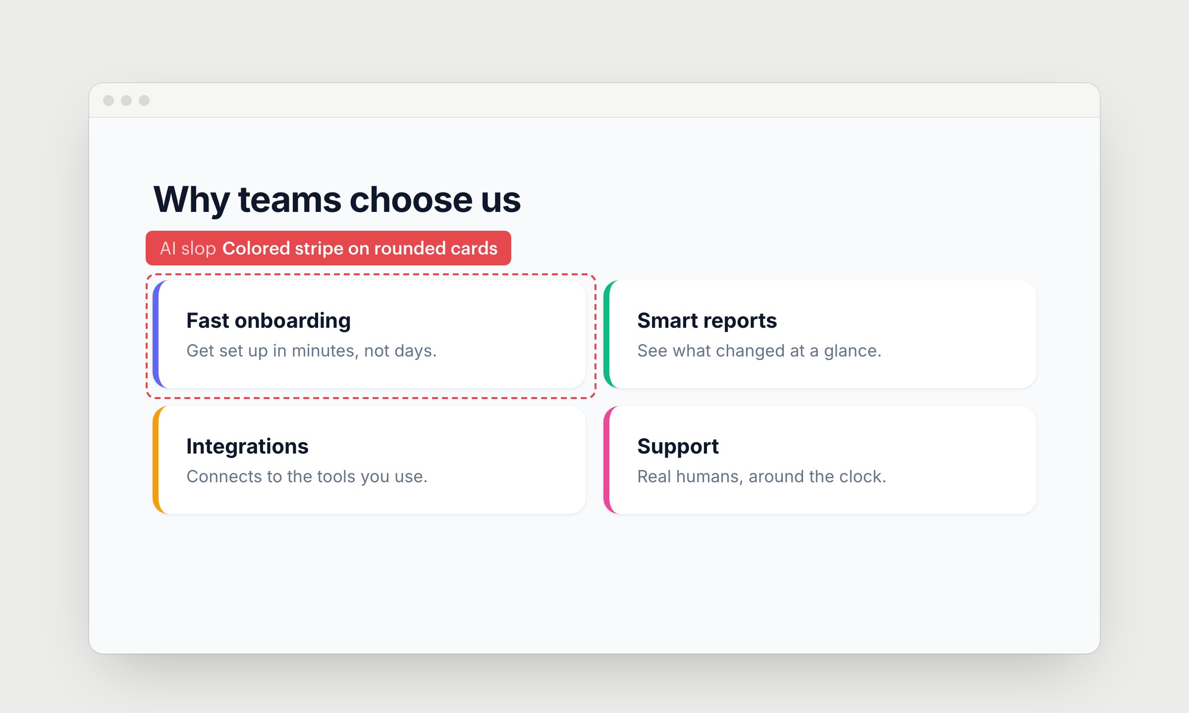
AI likes to add a thick colored border on the left side of every card. It makes a normal card look like a warning, and it looks odd with rounded corners.
Remove it unless the card has a status to show.
2. Cards inside cards
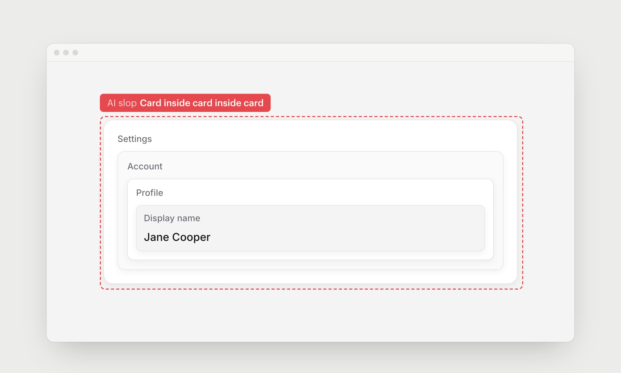
Here the settings sit in a card, the account in a card inside it, then the profile, then the field. That's 4 layers of padding and shadows around 1 name.
Use spacing, headings and dividers instead. They separate things just as well.
3. Colored italic text for accent
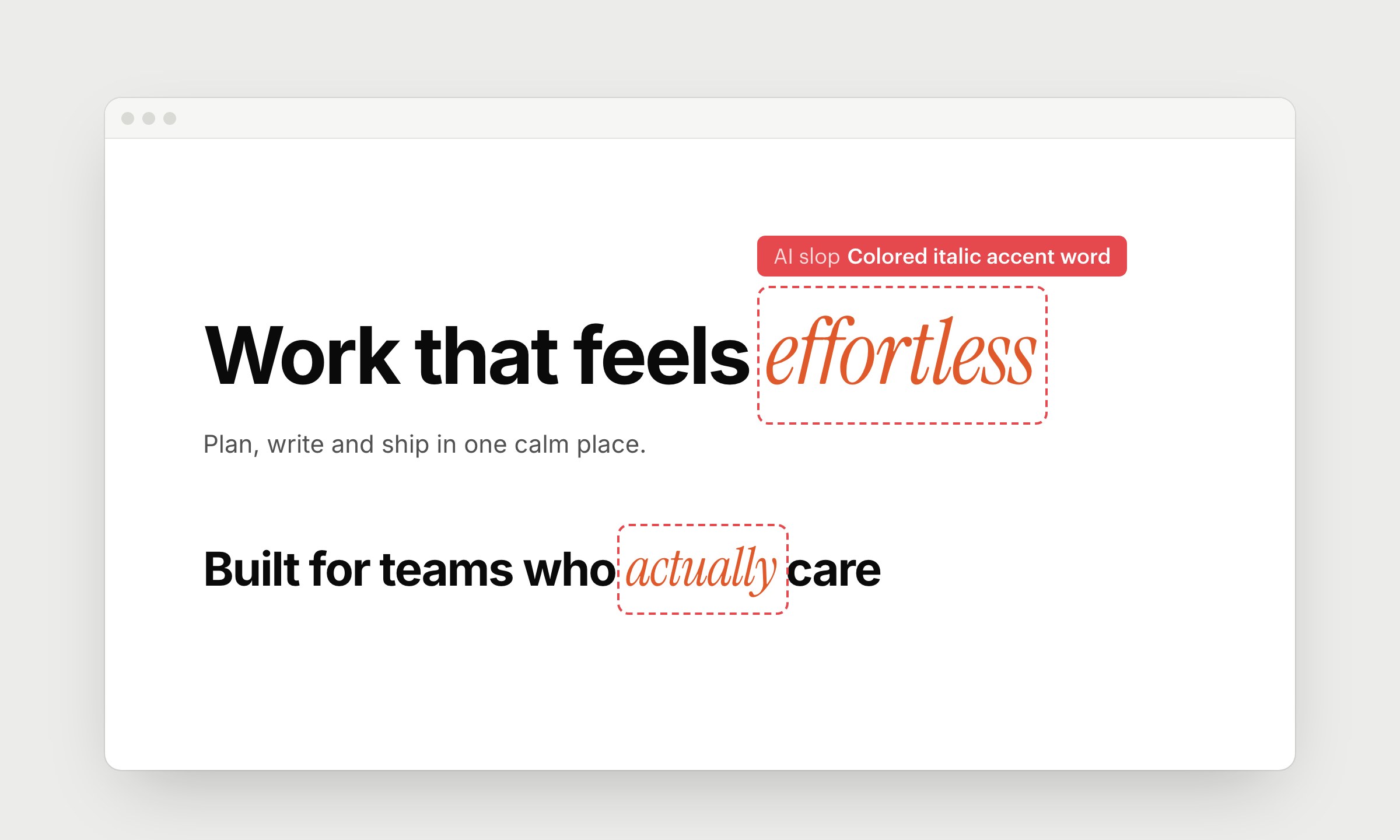
AI takes a bold headline and switches one word to a colored italic serif. Then it does the same in the next heading, and in the one after it. The word usually isn't more important than the rest. It just makes the headline look "designed".
Stress a word only when it matters, and do it once per page at most.
4. All caps pill badge and a label above the heading
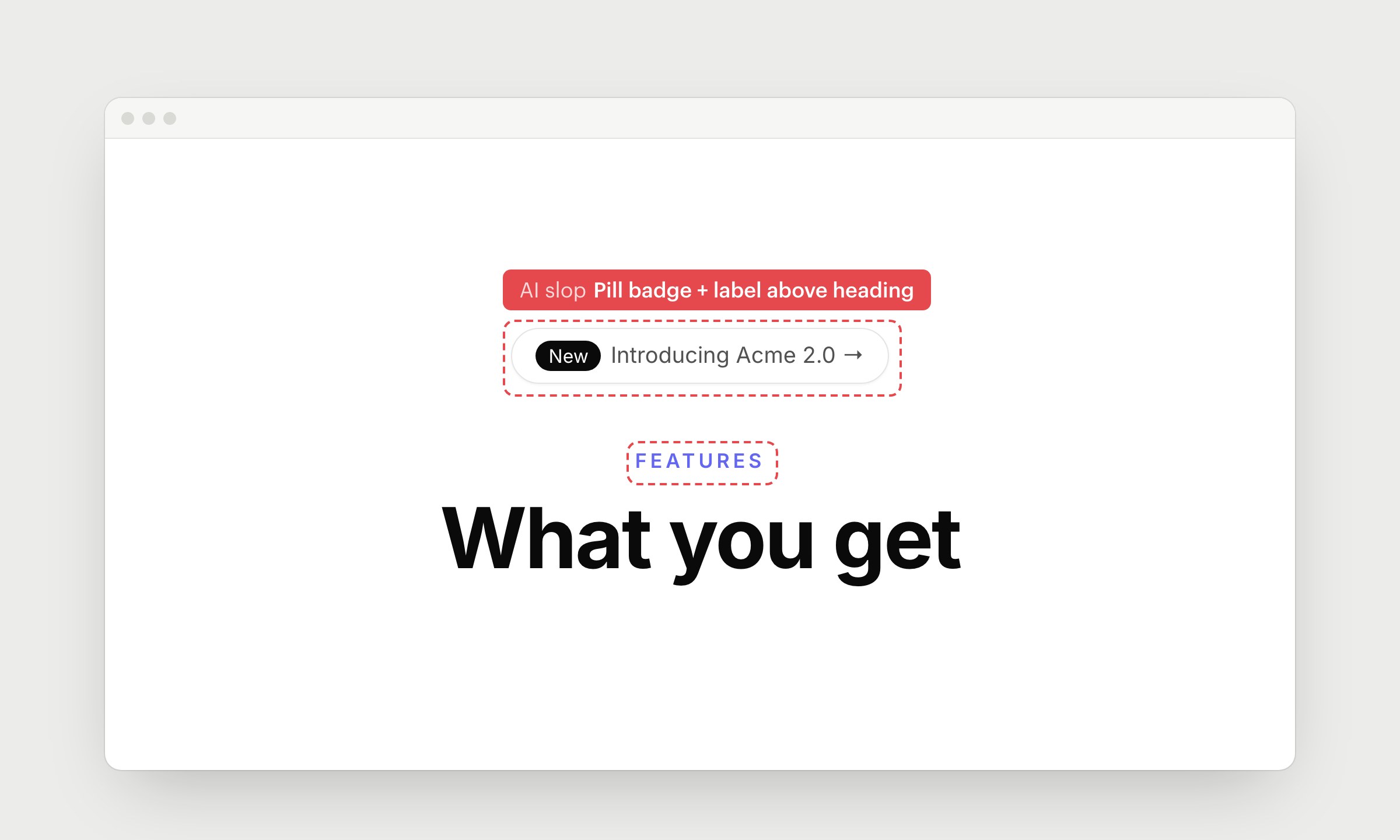
A pill that says "Introducing..." sits above the hero, and a tiny uppercase label sits above every section heading. The pill looks like a button but usually does nothing. The label repeats the heading.
Remove both. If they say something useful, put it in the heading.
5. Monospace labels and inputs
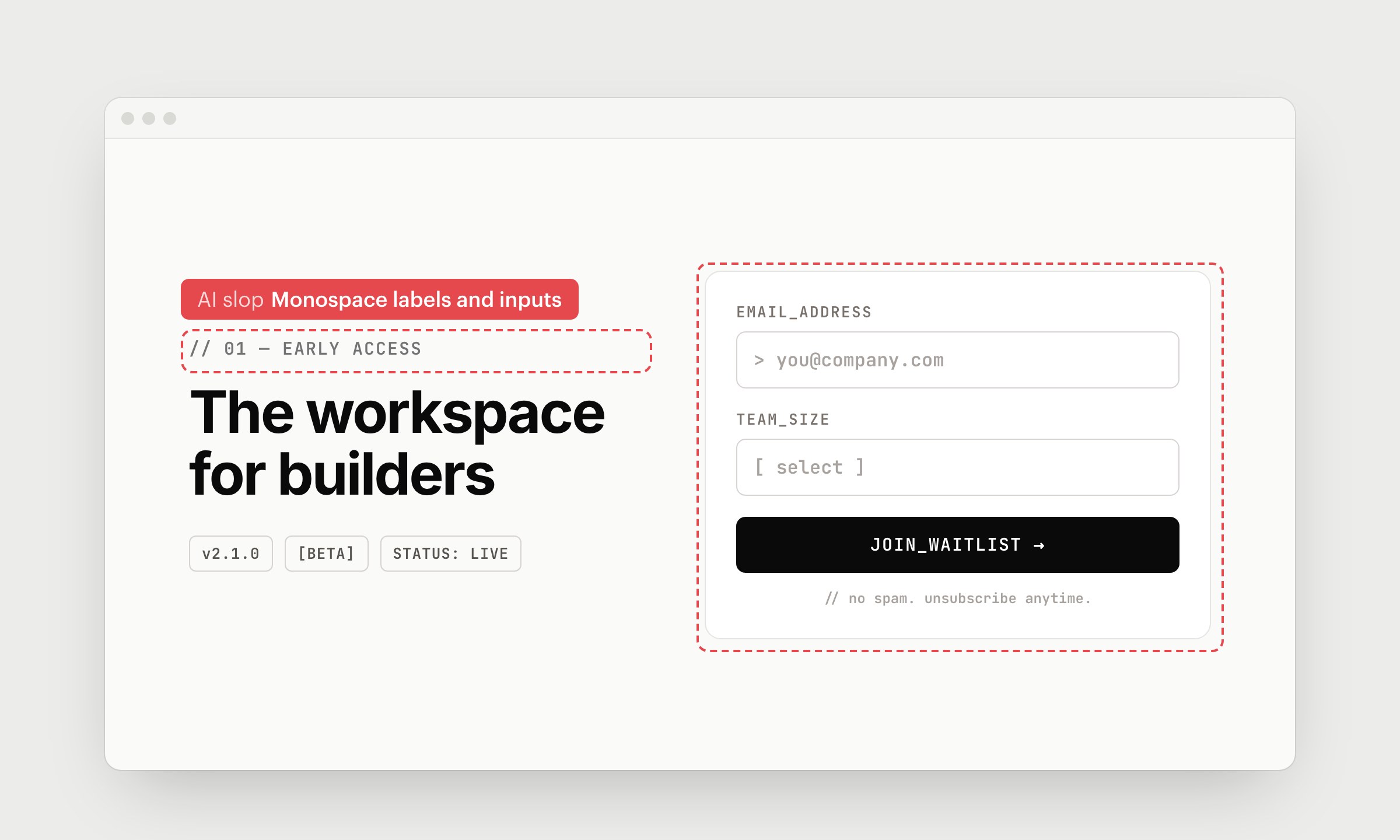
AI puts small labels, tags, inputs and buttons in a monospace font, often in caps with underscores and a "//" in front. It's meant to look technical, like a terminal. On a product that isn't a developer tool, it just looks borrowed, and now almost every AI-made page does it.
Use monospace for code, numbers in tables and anything people need to copy. Labels and buttons read better in your main font.
6. Numbers written as words
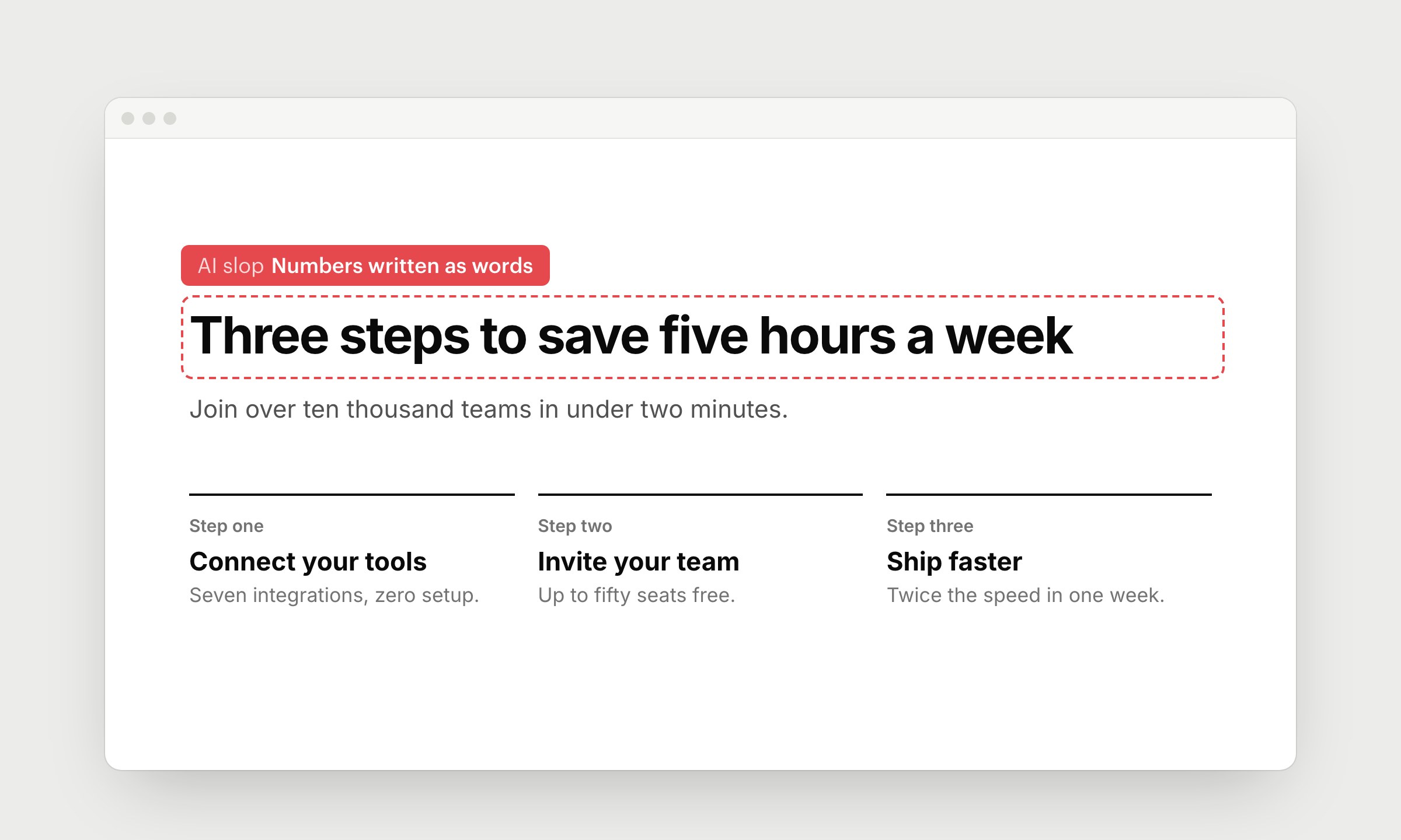
"Three steps", "five hours", "ten thousand teams", "Step one". AI spells out numbers in headings and buttons, and it's one of the easiest signs to spot in text. Numbers in words are also harder to scan. People look for digits on a page.
Write 3, not "three". The copy has more signs like this, see Signs of AI slop in writing.
7. Long titles full of nouns
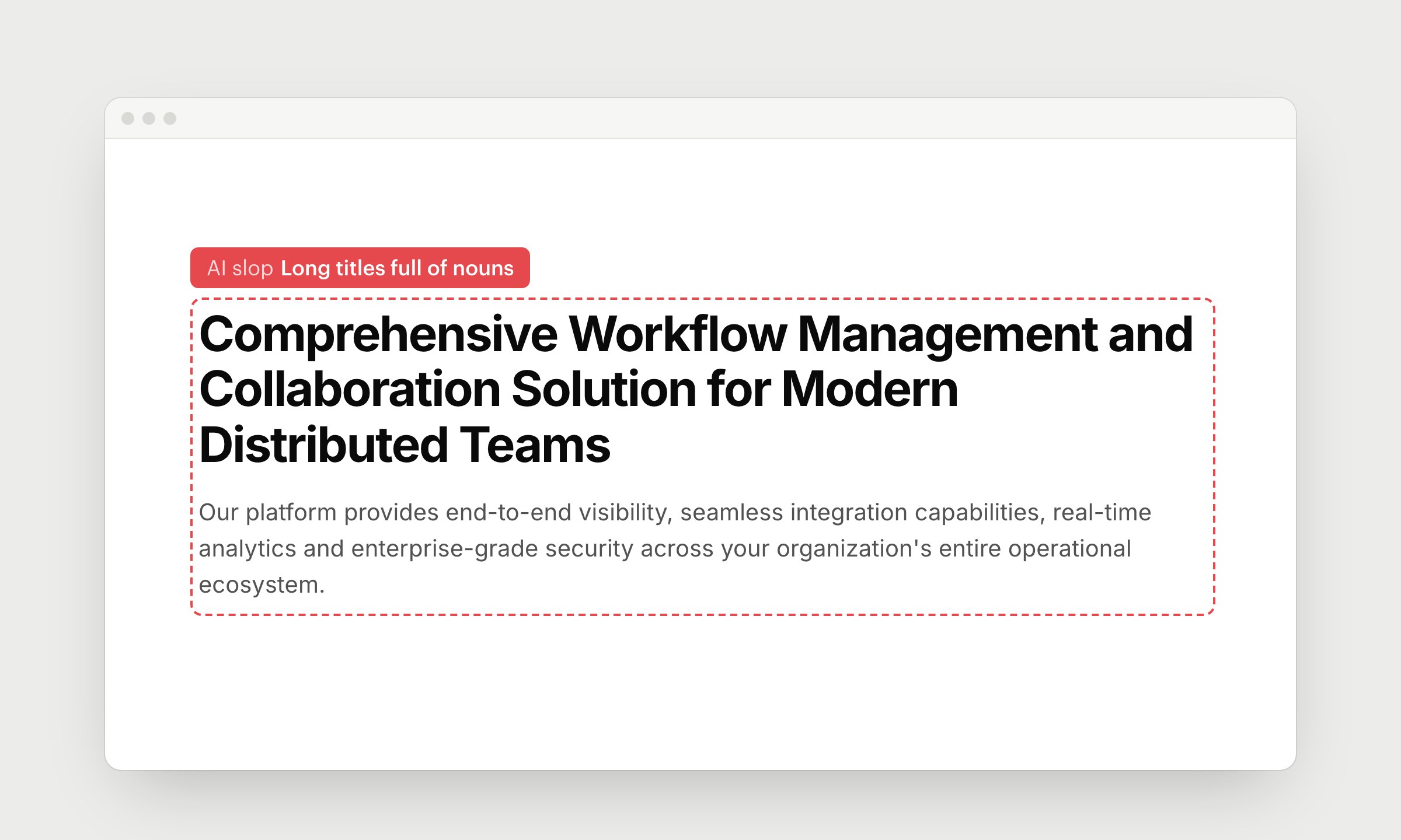
AI writes section titles like product categories: "Comprehensive Workflow Management and Collaboration Solution". The description under it lists features as nouns: visibility, capabilities, analytics, security. Nobody reads 3 lines of this, and nobody can tell who it's for.
Keep titles short and start them with a verb. Say what changes for a specific person, and leave the feature list for later. "Close your books in 2 days" with "Finance teams match bank transactions and send reports from one place" under it tells people more than any list of nouns.
8. Emoji as icons
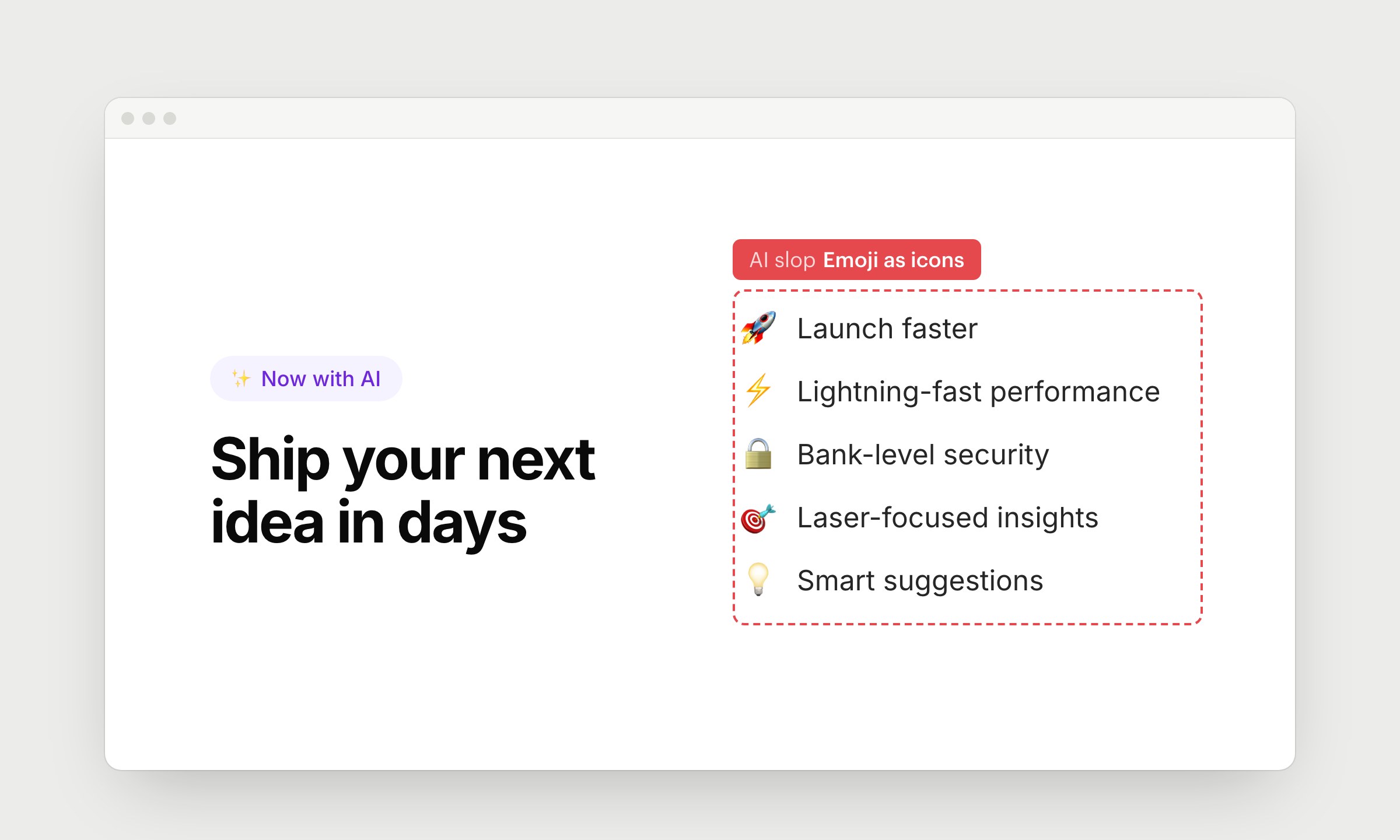
✨ for AI, 🚀 for speed, 🔒 for security. Emoji are the cheapest way for a model to add visuals, so it puts them in pills, lists and buttons. They look different on every device and don't match anything else on the page.
Pick 1 icon set and stick to it. Or skip icons, a plain list reads fine.
9. Placeholders instead of avatars, logos and images
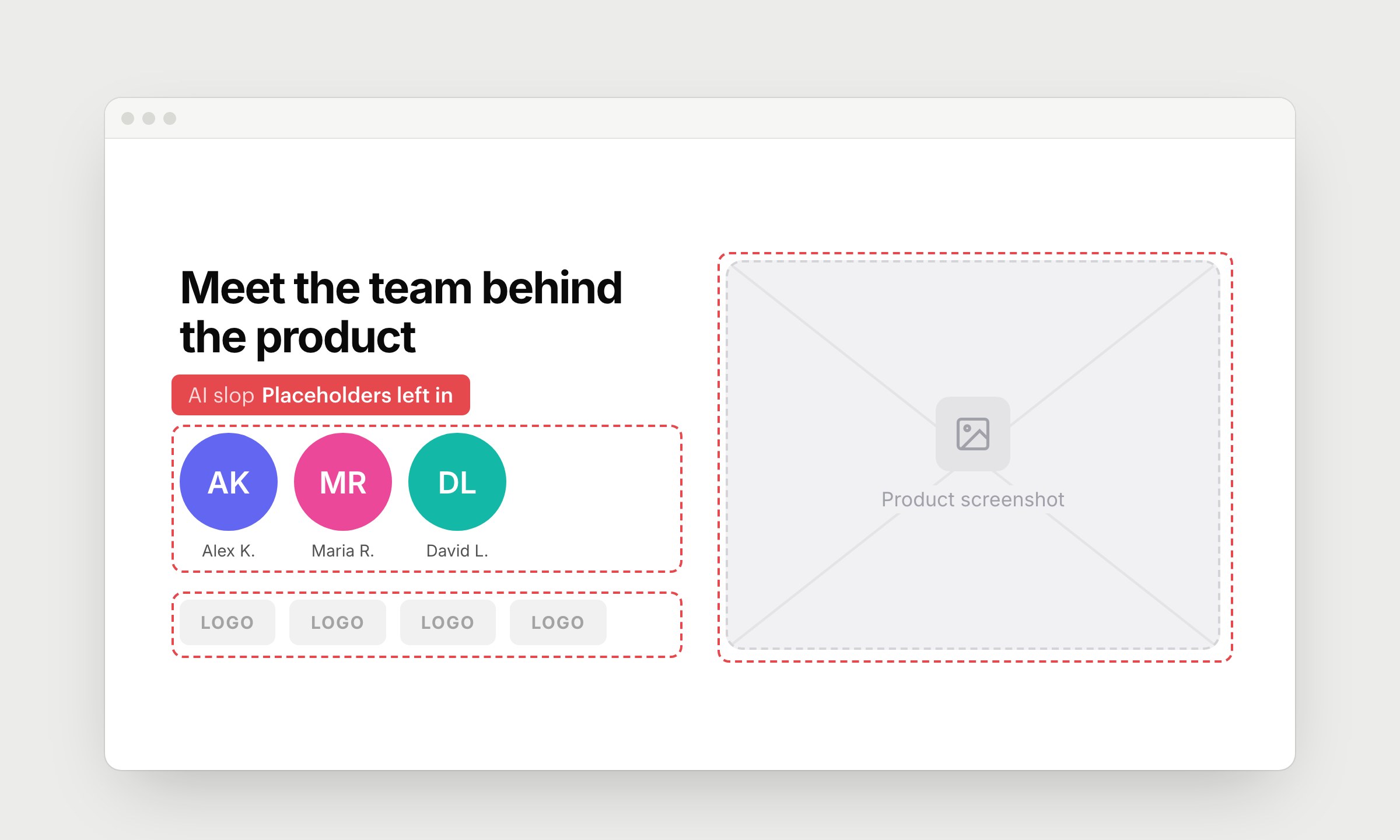
The team section has colored circles with initials instead of photos. The customer row has grey boxes that say "LOGO". The product is an empty frame with "Product screenshot" in the middle. AI can't take a photo of your team or your app, so it leaves a placeholder, and often nobody replaces it before launch.
Every important page needs at least 1 real image: a screenshot of your product or a photo of your team.
10. Overstuffed screens
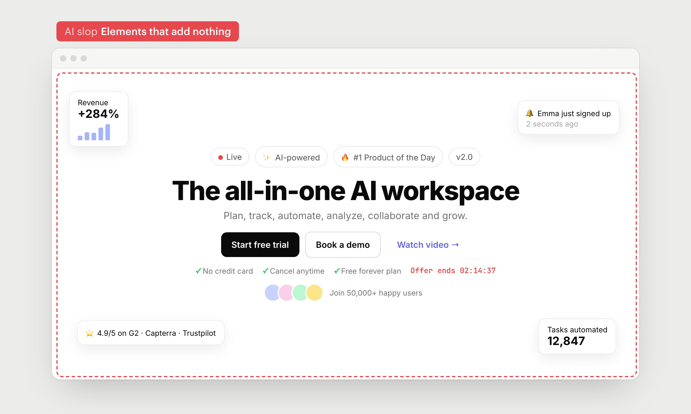
This hero has 4 chips above the headline, 3 buttons, checkmarks, a countdown, avatars and a floating card in every corner. Adding an element costs AI nothing, so it keeps going. Each element says very little, and together they hide the one thing you want people to do.
Keep a headline, a line under it and a button. Remove anything that doesn't help people decide.
11. Visual metaphors explained with labels
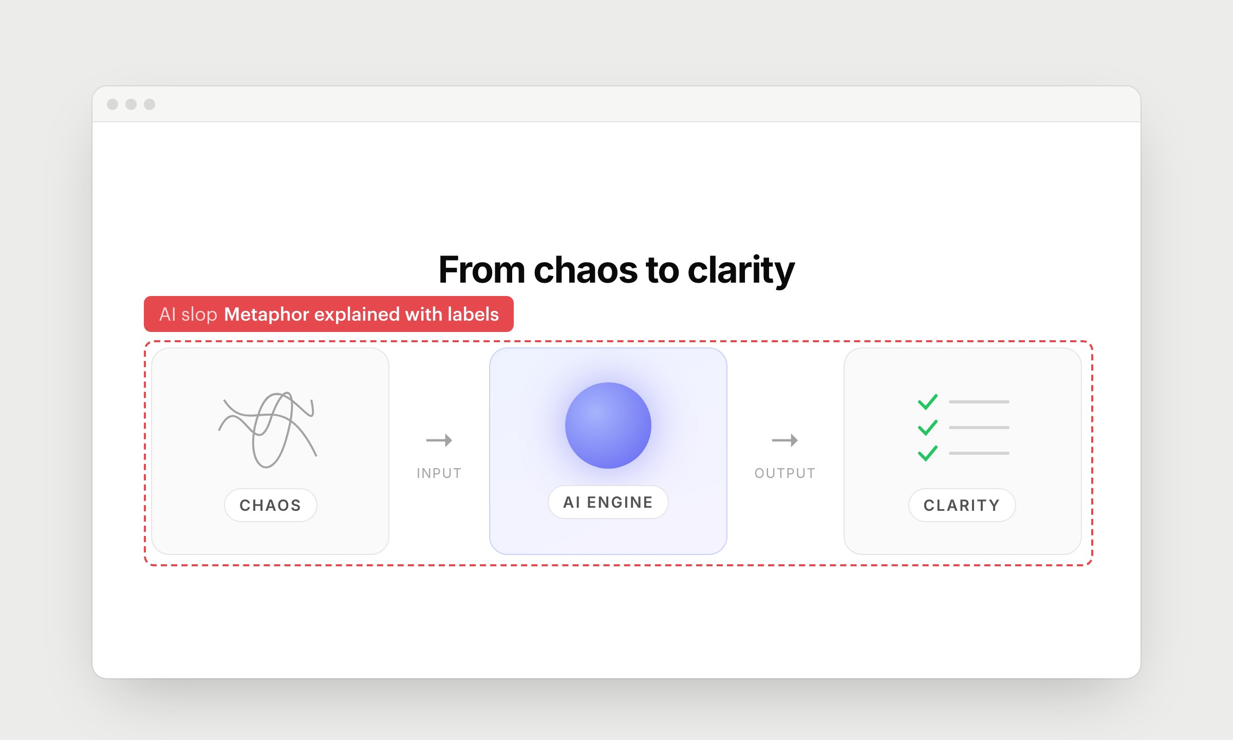
To show an idea, AI draws a scribble and writes "CHAOS" on it. Then a glowing ball with "AI ENGINE", a checklist with "CLARITY", and arrows that say "INPUT" and "OUTPUT". If a picture needs labels to make sense, it only repeats the headline.
Show the real thing: the messy spreadsheet your customers use today and the dashboard they get with you. If you can't show it, write one clear sentence and skip the drawing.
12. Demos made of text
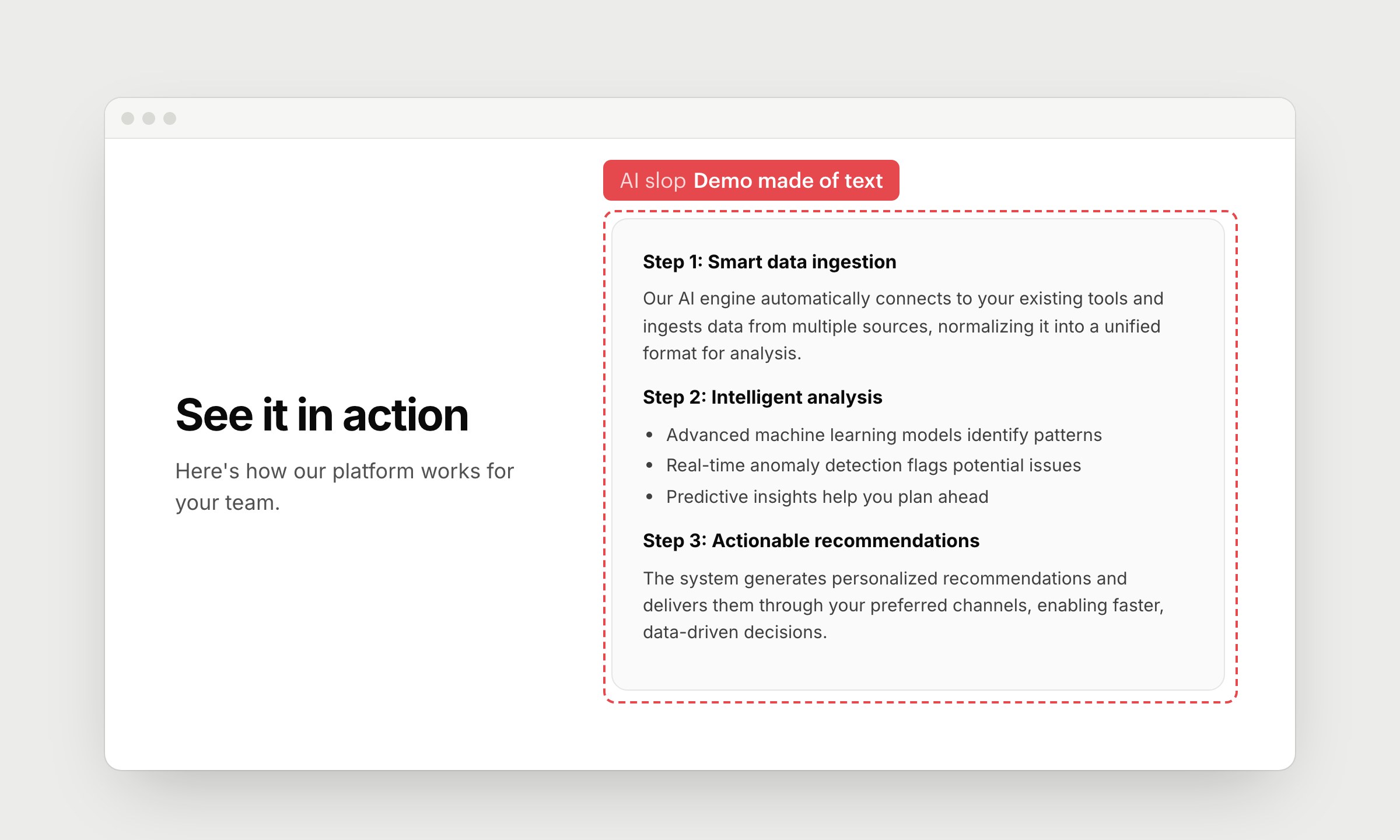
The section says "See it in action", and the "demo" is a box of paragraphs and bullet points. Step 1, step 2, step 3, each with sentences about AI engines and data-driven decisions. AI can write about your product much more easily than it can show it, so the demo turns into a manual.
Show the product doing the job: a screenshot, a short video or a GIF of 1 real task from start to finish. Keep the text to a caption.
13. Glass cards
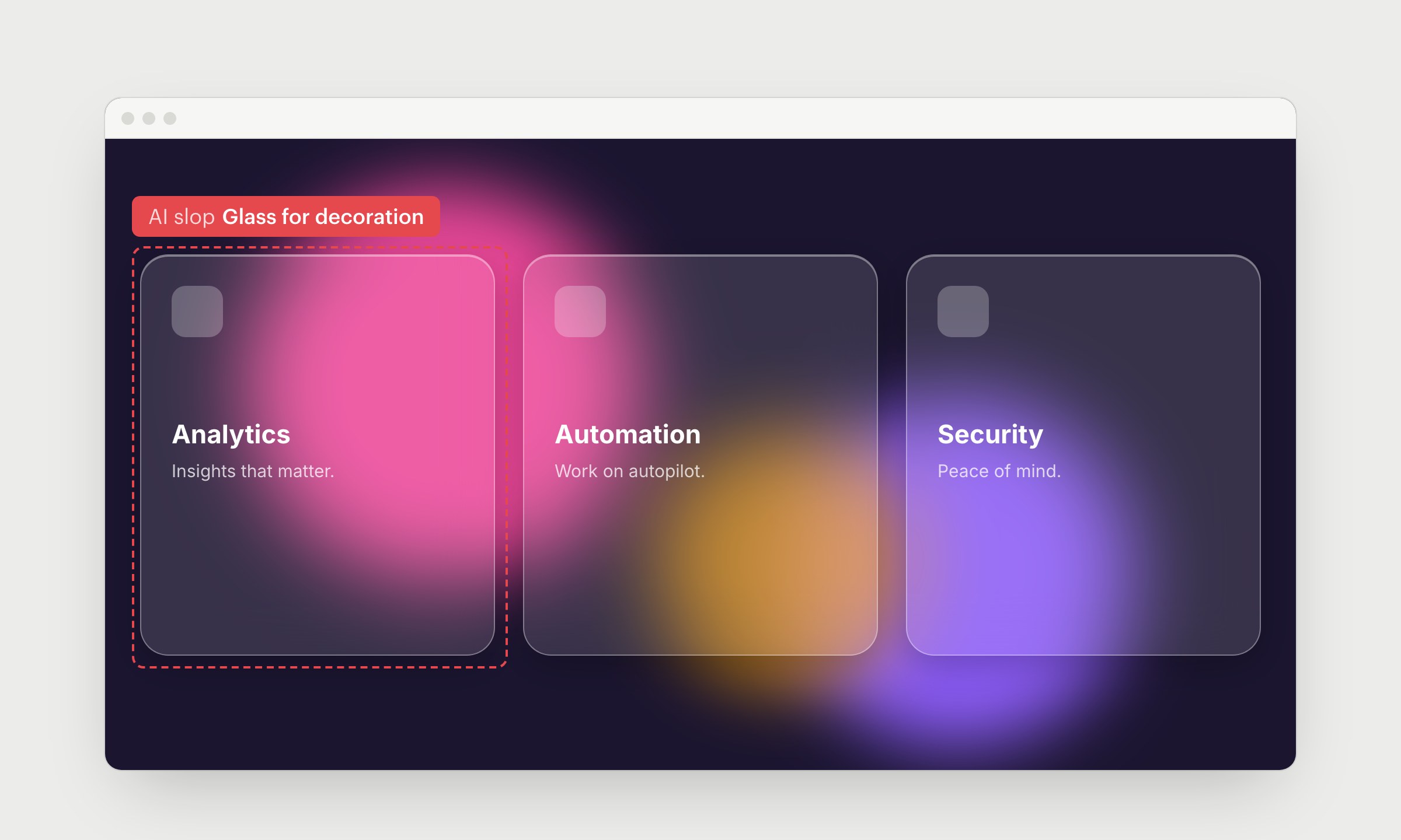
Frosted glass cards float over blurry color blobs. Blur makes sense when something sits on top of content, like a menu over a page. As decoration, it just makes text harder to read.
14. Same radius and shadow on everything
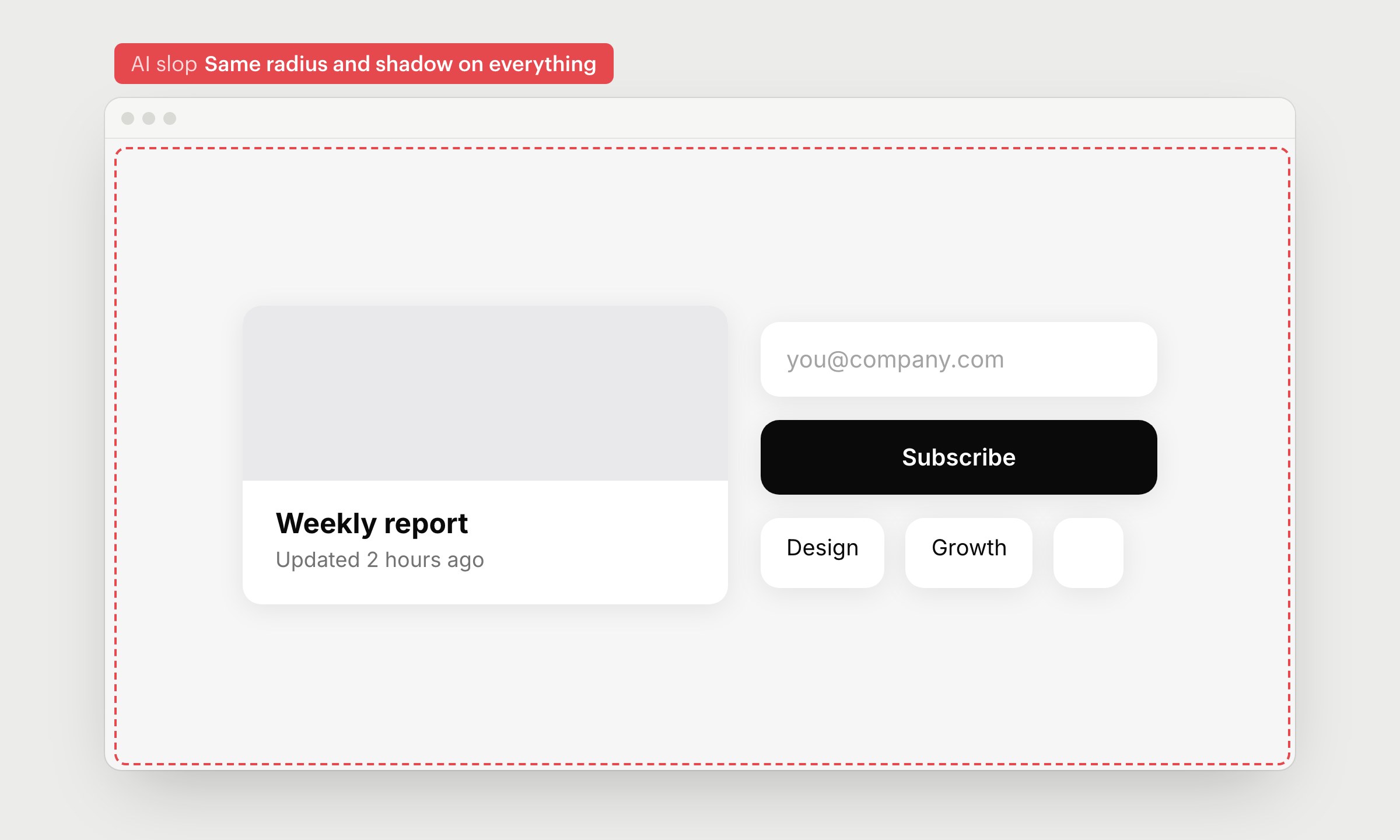
The card, input, button, tags and avatar all have 16px corners and the same soft shadow. Each one looks fine, but together the page goes flat, and you can't tell what's clickable.
Give different things different shapes. Buttons and cards don't need the same corners, and most elements don't need a shadow at all.
15. Light gray text on white
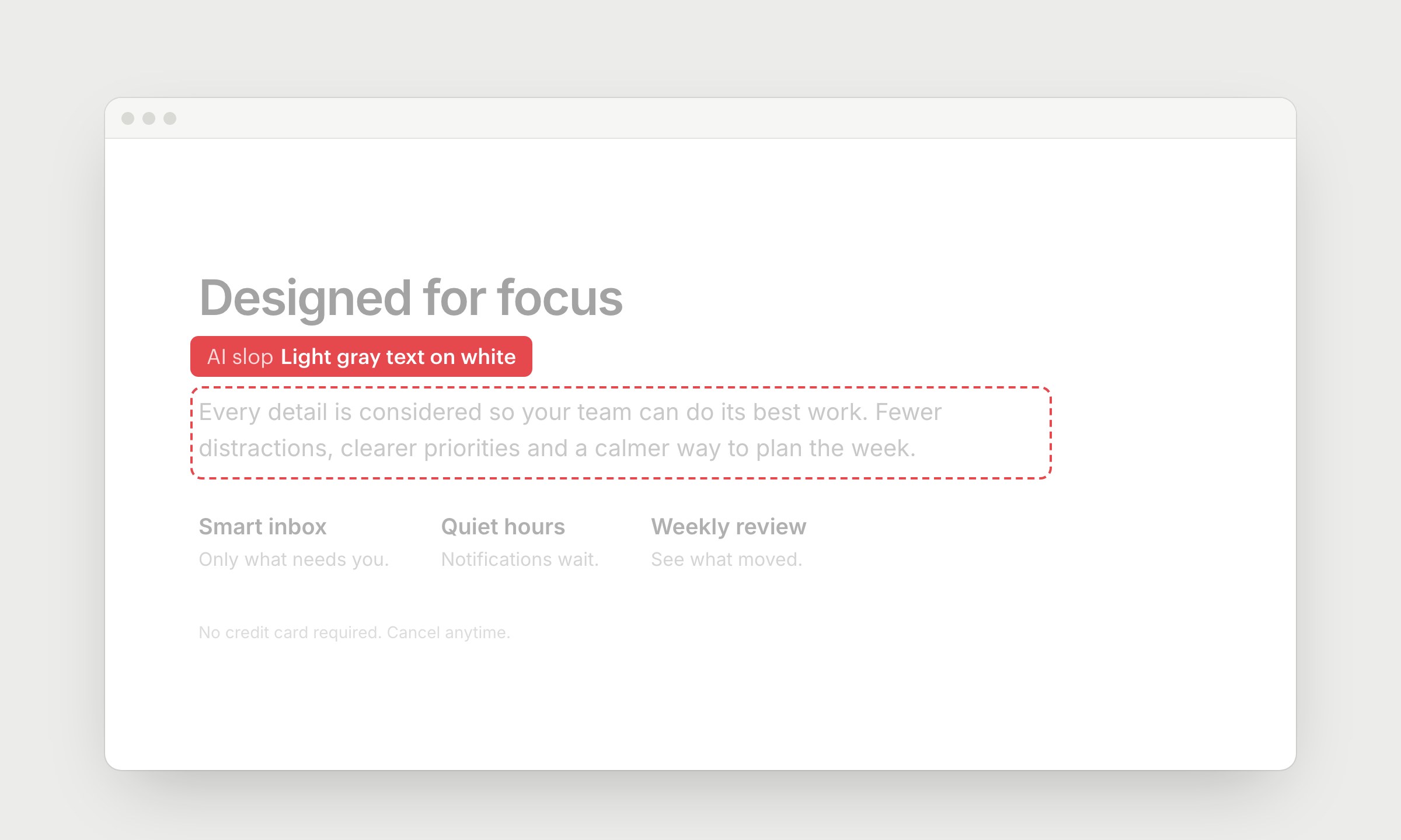
AI makes secondary text lighter and lighter to look "clean", until the body copy, captions and small print are hard to read. It looks calm in a screenshot. On a phone in the sun, people can't read it.
Body text needs a contrast of at least 4.5:1 against the background. Check it with any contrast checker, and keep light gray for things people can skip.
16. Animation and motion with nothing to say
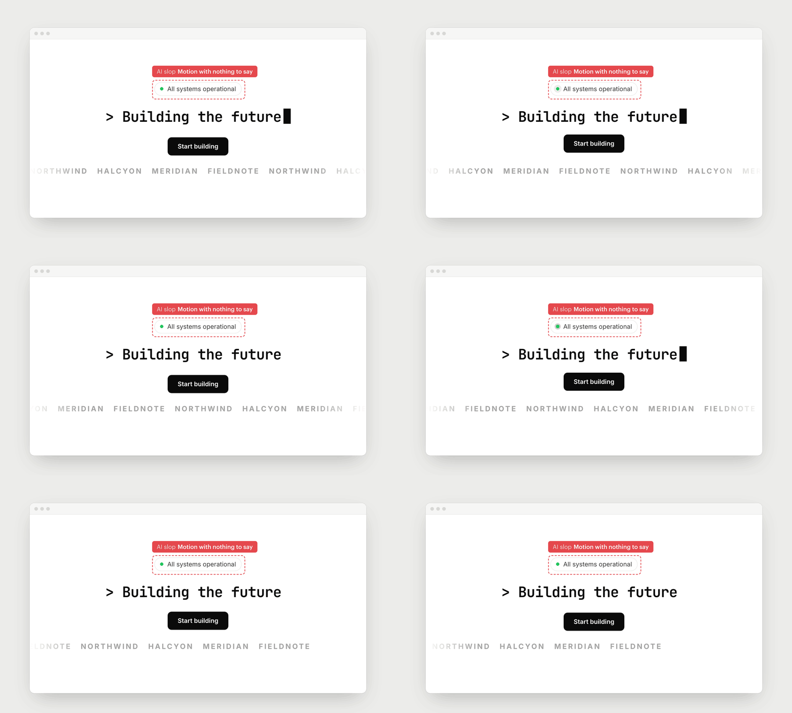
A status dot pulses, a cursor blinks after text you can't edit, a button bounces and the logos scroll by themselves. Everything on the page wants your attention at the same time.
Only animate things that change. If something moves on its own, let people pause it.
17. Heavy appear animations on every block
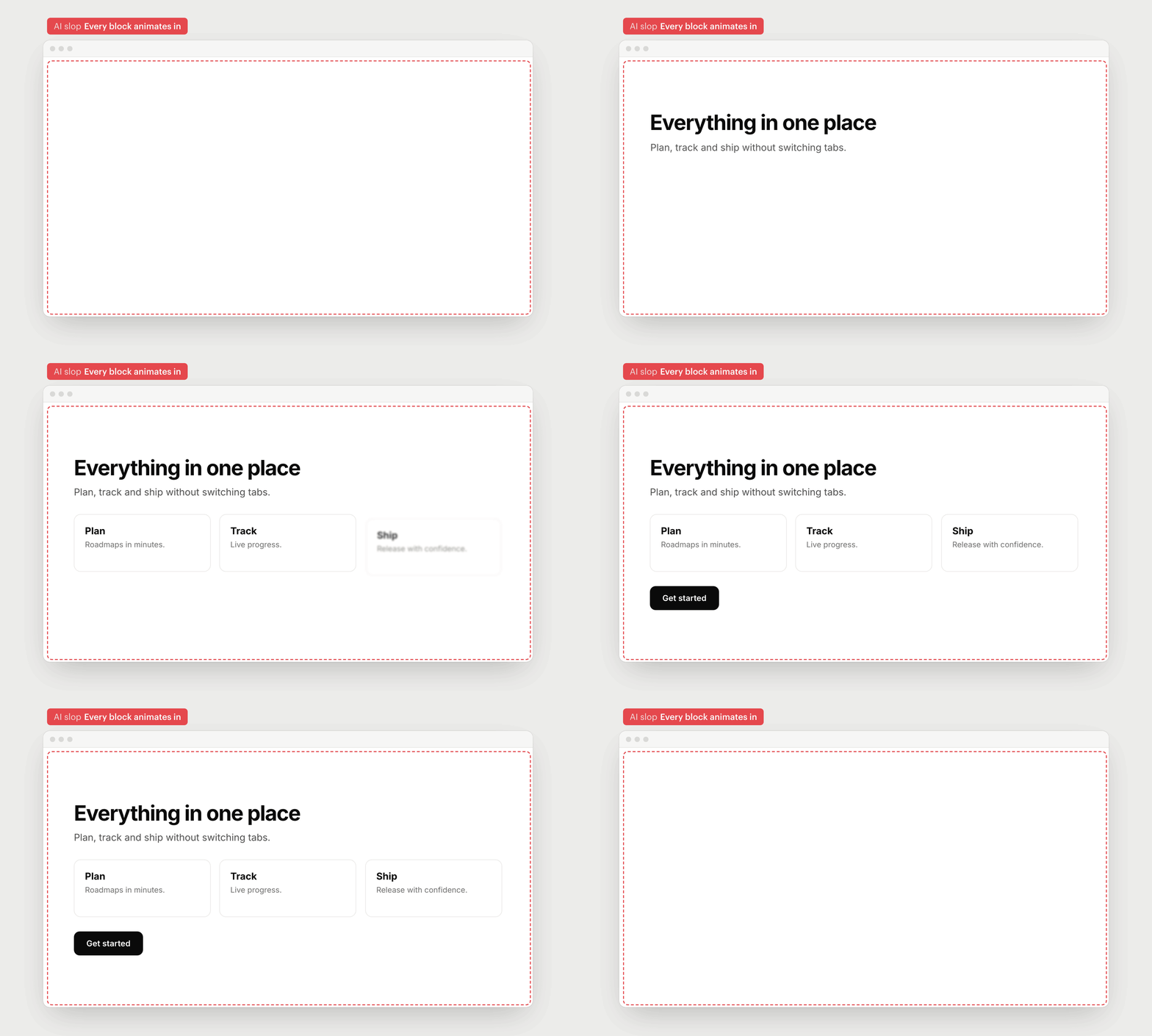
Every heading, paragraph, card and button fades in, slides up and unblurs as you scroll, one after another. The first time it looks smooth. By the 3rd section, people are waiting for the page to let them read. Fast scrollers see blank spaces, and if the script fails, the content never shows up.
Show content right away. If you want motion, animate 1 thing that matters, keep it short (under 300ms) and respect "reduce motion" settings.
18. Proof nobody can check
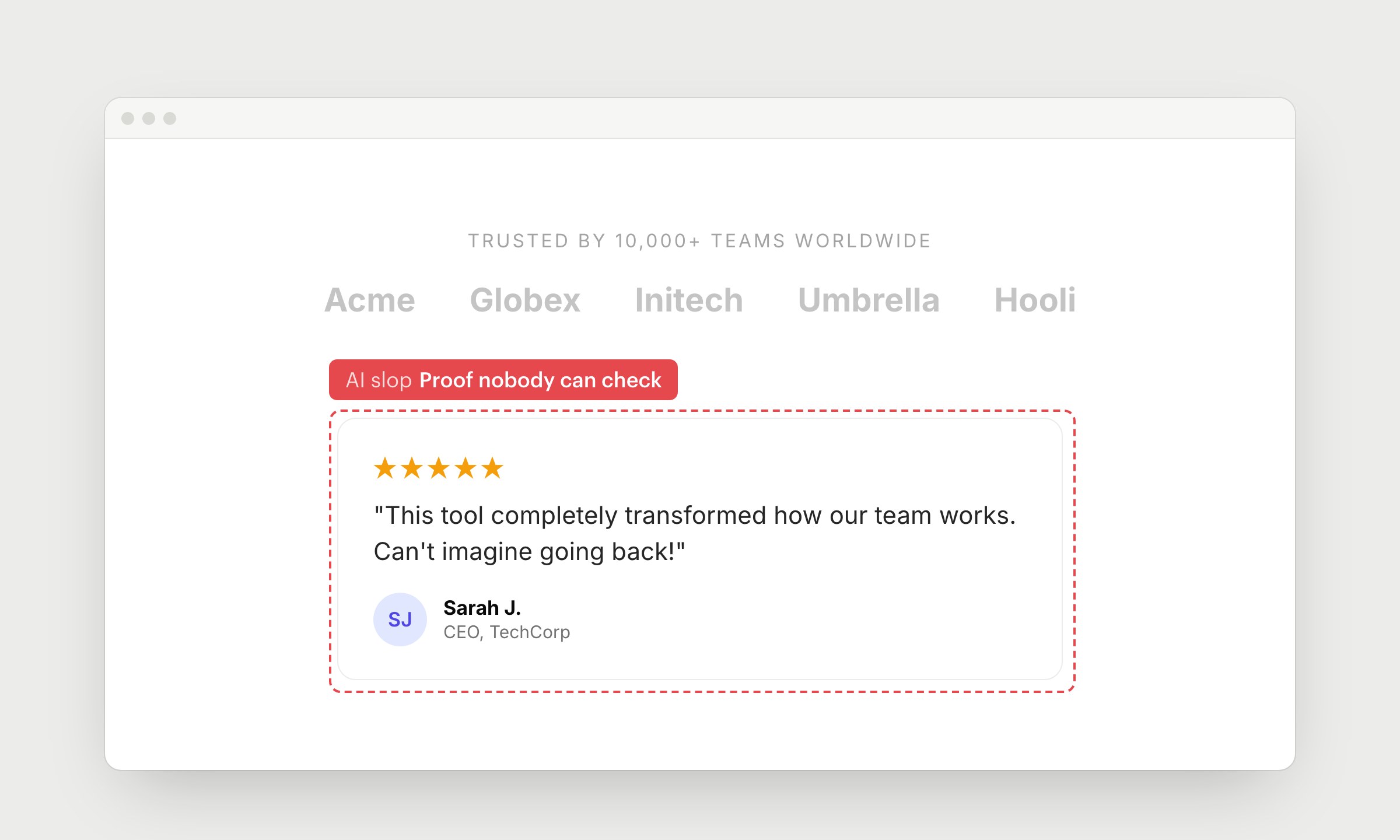
"Trusted by 10,000+ teams" on a site that launched last month. Logos of companies that have never heard of you. 5 stars from "Sarah J., CEO" with initials instead of a photo. People have seen this block on hundreds of sites and don't believe it anymore.
Use real names, roles and photos, and link to the source. If you don't have proof yet, leave the section out.
19. Purple gradients
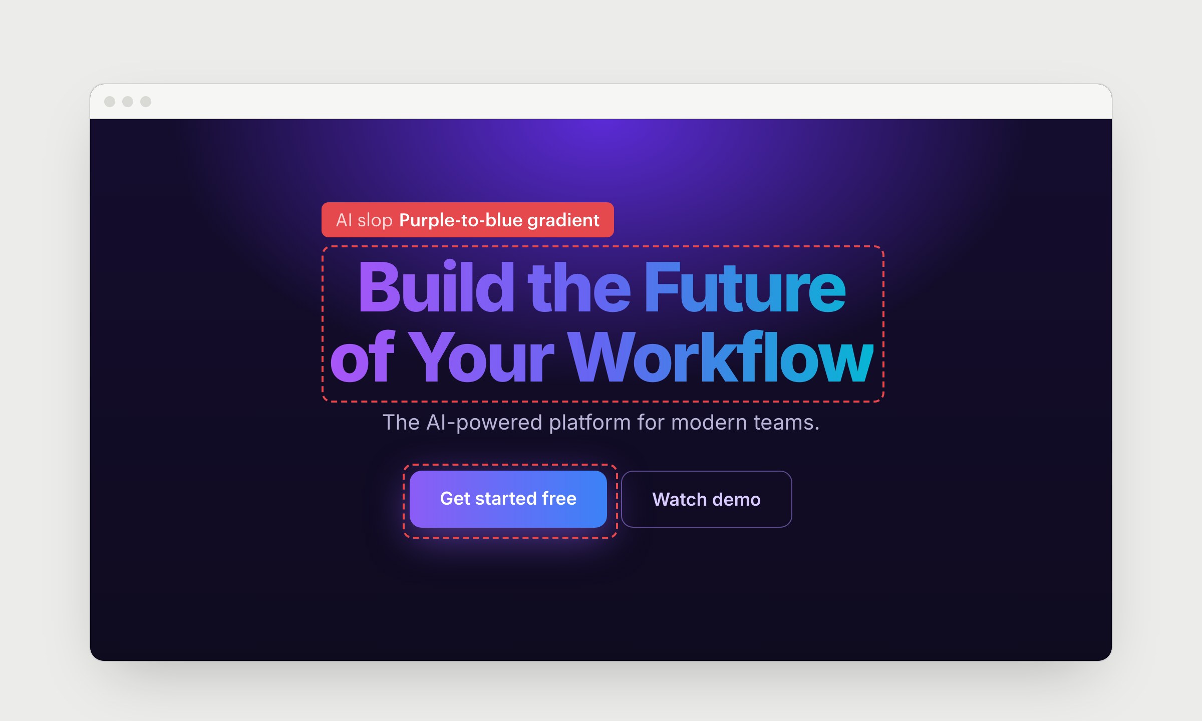
Purple to blue on the buttons, on the headline and in the background. Models picked this up around 2022 and still use it.
Gradient text is the worst part. Use one solid color and make important words bigger or bolder. Pick colors that fit your product.
20. Glow, neon and grid lines on dark
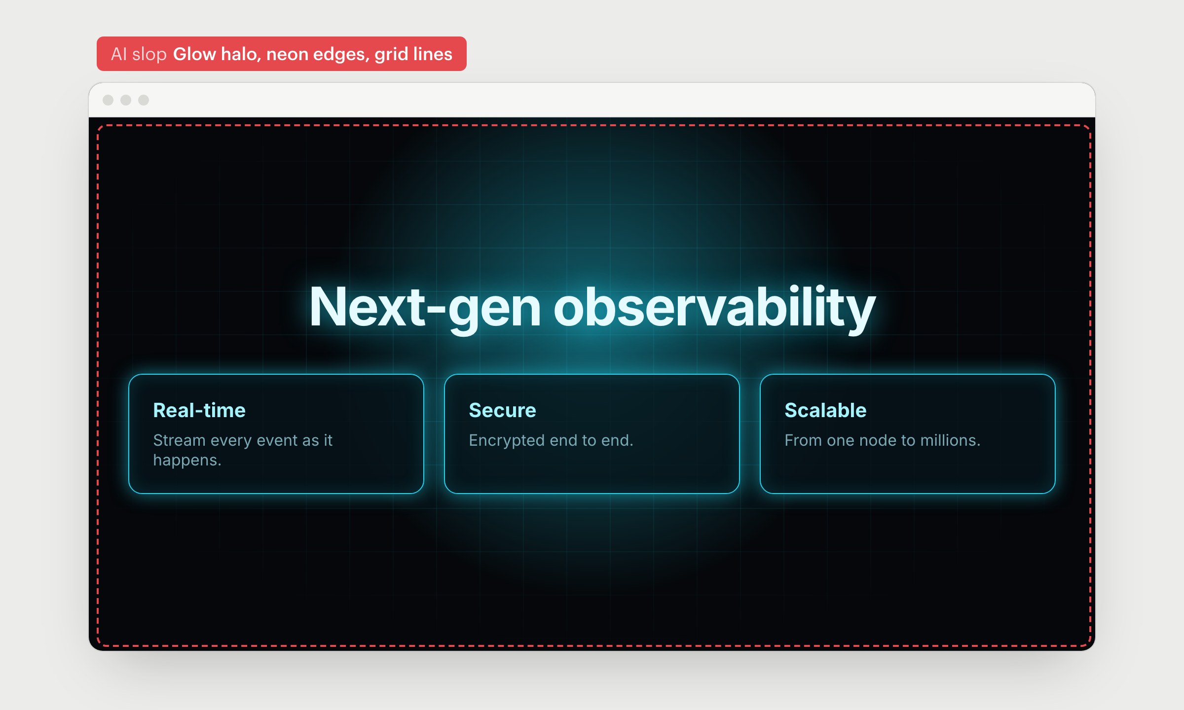
A bright glow behind the heading, neon borders on the cards and a faint grid in the background. Dark mode can look great, but when everything glows, nothing stands out.
Remove the glow and the grid (grids belong on maps and canvases). Keep a little neon only where you want people to look.
How to keep your design from looking like everyone else's:
- Show the agent real products you like before it starts, and give it your brand colors and fonts
- Make 1 thing on the page memorable and keep the rest simple
- Use real screenshots, photos and quotes
- Ask the agent to critique the page before you ship it
Design skills help too. Anthropic's frontend-design skill tells Claude to avoid Inter, purple gradients and emoji icons, and Impeccable can scan a page for most of the signs above. They catch the obvious stuff, but you still need to look at the page yourself.
AI gets you to an average page fast. The rest is up to you.
PRO tip: If your page already looks like this, give your coding agent this prompt:
Ship faster than
your competition
Focus on customers and sales while we handle product delivery. Hire a dedicated AI maker or a whole product team.
Launch new products
Fix your delivery
Hit fundraising milestones
[Analytics Chart]
Wireframe v0.1
Sarah Chen CEO, Founder
$127k
MRR
2,847
Customers
+23%
Growth
Sales Performance
Latest Deal
Enterprise plan closed
Acme Corp · $12k/mo


Services
Industries
Hire
Claude Code Devs Next.js DevsReact DevsReact Native DevsSupabase DevsLovable DevsAI EngineersFull-stack Devs Upwork Alternative
AI Tools
Resources
Kickstart No-Code Stack Tech Stack Tech Trends AI SaaS Skills MCP Servers Academy Help Center Blog Changelog
Our products


'%3e%3cpath%20fill-rule='evenodd'%20clip-rule='evenodd'%20d='M2500%201250C2500%201940.36%201940.36%202500%201250%202500C559.644%202500%200%201940.36%200%201250C0%20559.644%20559.644%200%201250%200C1940.36%200%202500%20559.644%202500%201250ZM1030.7%20697.9C986.2%20688.4%20937%20683.6%20883.1%20683.6H350V1816.5H899.1C949.1%201816.6%20999%201810.2%201047.4%201797.5C1095.5%201784.8%201138.3%201765.3%201175.9%201738.8C1213.5%201712.4%201243.4%201678.3%201265.6%201636.5C1287.8%201594.7%201298.9%201545.2%201298.9%201488.1C1298.9%201417.2%201281.7%201356.6%201247.3%201306.4C1212.9%201256.2%201160.8%201221%201091%201200.9C1141.7%201176.6%201180.1%201145.4%201206%201107.3C1231.9%201069.2%201244.9%201021.6%201244.9%20964.5C1244.9%20911.6%201236.2%20867.2%201218.7%20831.2C1201.2%20795.2%201176.6%20766.4%201144.9%20744.7C1113.2%20723%201075.2%20707.4%201030.7%20697.9ZM960.9%201110.4C932.3%201131.5%20895.8%201142.1%20851.4%201142.1L599.2%201142.3V877.3H832.3C853.9%20877.2%20875.4%20879.1%20896.6%20882.8C917.2%20886.5%20935.4%20893.1%20951.3%20902.6C967.2%20912.1%20979.9%20925.4%20989.4%20942.3C998.9%20959.2%201003.7%20980.9%201003.7%201007.3C1003.8%201054.9%20989.5%201089.2%20960.9%201110.4ZM935.5%201615.7C912.6%201620.5%20889.2%201622.9%20865.7%201622.8L599.2%201622.9V1311.9H870.5C924.4%201311.9%20967.8%201324.3%201000.6%201349.2C1033.4%201374%201049.8%201415.6%201049.8%201473.7C1049.8%201503.3%201044.7%201527.7%201034.7%201546.7C1024.6%201565.7%201011.1%201580.8%20994.2%201591.9C977.3%201603%20957.7%201610.9%20935.5%201615.7ZM1758.3%201648.2C1694.8%201648.2%201646.1%201631.8%201612.3%201599C1578.5%201566.3%201560%201513.4%201556.9%201440.7H2148.7C2152.9%201377.2%202147.6%201316.4%202132.8%201258.2C2118%201200%202093.9%201148.2%202060.6%201102.7C2027.3%201057.2%201984.7%201021%201932.9%20994C1881%20967%201820.2%20953.5%201750.4%20953.5C1688%20953.5%201631.1%20964.6%201579.8%20986.8C1528.5%201009%201484.3%201039.4%201447.3%201078C1410.3%201116.6%201381.7%201162.3%201361.6%201215.2C1341.5%201268.1%201331.5%201325.2%201331.5%201386.5C1331.5%201449.9%201341.3%201508.1%201360.8%201561C1380.3%201613.9%201408.1%201659.3%201444.1%201697.4C1480.1%201735.5%201524%201764.9%201575.8%201785.5C1627.6%201806.1%201685.8%201816.4%201750.3%201816.4C1843.4%201816.4%201922.7%201795.2%201988.3%201752.9C2053.9%201710.6%202102.6%201640.3%202134.3%201541.9H1936C1928.6%201567.3%201908.5%201591.4%201875.7%201614.1C1842.9%201636.8%201803.8%201648.2%201758.3%201648.2ZM1744%201123.1C1799%201123.1%201840%201137.9%201867%201167.5C1893.9%201197.1%201912.7%201240.5%201923.4%201297.5H1556.9C1557.9%201281.7%201561.4%201263.7%201567.2%201243.6C1573%201223.5%201583%201204.5%201597.3%201186.5C1611.6%201168.5%201630.6%201153.5%201654.4%201141.3C1678.1%201129.2%201708%201123.1%201744%201123.1ZM1976.2%20741.1H1518.3V868.1H1976.2V741.1Z'%20fill='white'/%3e%3c/g%3e%3cdefs%3e%3cclipPath%20id='clip0_52_236'%3e%3crect%20width='2500'%20height='2500'%20fill='white'/%3e%3c/clipPath%3e%3c/defs%3e%3c/svg%3e)
'%3e%3cpath%20d='M444.031%20372.208C477.51%20456.911%20502.37%20544.115%20518.526%20633.203C541.573%20619.151%20563.115%20602.266%20582.693%20582.693C633.547%20531.833%20666.365%20467.75%20677.958%20398.198C628%20377.531%20573.286%20366.094%20515.948%20366.094C491.438%20366.094%20467.417%20368.208%20444.031%20372.208V372.208Z'%20fill='white'/%3e%3cpath%20d='M582.979%20100.266C582.88%20100.172%20582.786%20100.068%20582.693%2099.974C518.219%2035.5052%20432.505%20-7.62939e-06%20341.333%20-7.62939e-06C305.682%20-7.62939e-06%20270.865%205.45312%20237.828%2015.9219C290.781%2082.2656%20337.365%20153.068%20377.286%20227.896C452.495%20195.964%20521.771%20152.698%20582.979%20100.266Z'%20fill='white'/%3e%3cpath%20d='M609.797%20130.479C545.589%20185.63%20473.839%20230.323%20395.761%20263.724C407.271%20286.896%20418.141%20310.437%20428.401%20334.328C457.052%20328.875%20486.287%20326.094%20515.948%20326.094C573.401%20326.094%20629.282%20336.427%20682.308%20356.766C682.537%20351.641%20682.667%20346.5%20682.667%20341.339C682.667%20263.88%20657.032%20190.375%20609.797%20130.479V130.479Z'%20fill='white'/%3e%3cpath%20d='M131.234%20610.401C190.99%20657.255%20264.208%20682.667%20341.333%20682.667C390.354%20682.667%20437.792%20672.385%20481.203%20652.875C464.932%20558.594%20438.88%20467.625%20404.12%20381.047C283.323%20414.016%20183.802%20499.026%20131.234%20610.401V610.401Z'%20fill='white'/%3e%3cpath%20d='M334.88%20362.656C352.438%20355.229%20370.333%20348.938%20388.51%20343.76C378.917%20321.792%20368.74%20300.135%20358.031%20278.786C265.818%20313.026%20168.854%20330.375%2069.25%20330.375C46.1094%20330.375%2023.1198%20329.422%200.296875%20327.557C0.114583%20332.135%200%20336.729%200%20341.339C0%20432.51%2035.5052%20518.224%2099.974%20582.693C99.9948%20582.714%20100.021%20582.734%20100.042%20582.755C122.339%20538.286%20151.5%20497.87%20187.031%20462.333C229.745%20419.625%20279.484%20386.089%20334.88%20362.656Z'%20fill='white'/%3e%3cpath%20d='M339.323%20242.859C298.818%20167.844%20251.427%2097.0677%20198.016%2031.3698C162.021%2048.0417%20128.859%2071.0885%2099.974%2099.974C48.3281%20151.62%2015.2917%20216.906%204.1875%20287.708C25.6458%20289.464%2047.3438%20290.375%2069.25%20290.375C164.052%20290.375%20255.016%20273.594%20339.323%20242.859Z'%20fill='white'/%3e%3c/g%3e%3cdefs%3e%3cclipPath%20id='clip0_107_362'%3e%3crect%20width='682.667'%20height='682.667'%20fill='white'/%3e%3c/clipPath%3e%3c/defs%3e%3c/svg%3e)
© 2026 Paralect, Inc 651 N Broad St, Suite 206, Middletown, 19709, Delaware, United States